Fonts: Why they do more for your brand vibe than your logo (yes, I said it)
Why choosing strategic brand fonts is the underrated business move that actually matters.
You’ve heard about colour psychology (okay, maybe from me bangin’ on about it). And yep, colour is powerful.
And you know alllll about logos (it’s always “can you make me a logo for free?”, never, “can you choose my fonts for free?”).
But let’s zoom in on something way more underrated…
Your brand fonts.
Not to be dramatic, but your fonts matter way more than your logo.
Because unless you’re Nike or Apple (not yet, anyway), your logo isn’t the first thing people recognise. But your fonts? They’re everywhere. Website headers. Instagram carousels. Email sign-offs. Even your open/closed sign if you’re a brick-and-mortar store.
Logos may get all the glory, but brand fonts do the damn work.

Rule Design logos vs brand fonts in action
Quick disclaimer: If you are getting signage or packaging printed, your logo is obviously pretty important too. You’ll want to invest in the full brand shebang so you don’t find your bank account dry from reprinting everything 3-months down the line.
But if you’re a service provider or digital-first business? If you’re going to obsess over one thing in your visual identity, let it be this:
How your brand speaks, through your fonts.
Let’s dig into why I always start with fonts when I’m building a strategic brand identity.
(Yes, even before I design the logo! That’s how I came up with this content idea.)
Fonts have feelings (and they’re doing emotional labour for free)
Fonts are emotional. Not the Bridget-jones-crying-into-an-icecream-tub-emotional way. But they give you all of the vibes. They tell people who you are, how you show up, and what kind of energy they can expect.
Just like tone of voice, font psychology taps into subconscious cues of emotional branding:
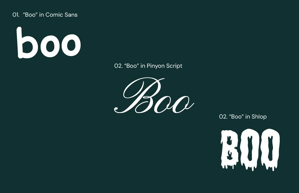
A bold, geometric sans-serif? Confident. Tech-forward.
A serif with soft curves? Warm, thoughtful, reliable.
A soft script? Intimate. Romantic. High-touch.
A slightly imperfect handwritten font? Human. Honest. Maybe a little messy (in an endearing way).
A tall, all-caps display font? Loud, confident, unmissable.
Feeling the difference in emotions?
This is font psychology in action, and it taps straight into the subconscious. It’s the design version of a gut feeling.
Even small shifts in typography can drastically change the tone of a message. Fonts aren't just communication tools — they shape the emotional perception of your words before anything is even read (Wyatt, C.S., and DeVoss D.W., Type Matters, 2018).
A recent study published in Sage Journals found that people consistently associate certain typefaces with specific personality traits — for example, serif fonts were more likely to be described as mature and trustworthy, while display fonts were viewed as youthful or casual (Sheen et al., 2025).
When you choose fonts with intention, they make everything from your captions to your checkout page feel 100x more cohesive.
If you want the deep-dive on each font category and the emotions they carry, head over to part one of my Type Psych 101 series.
Fonts are everywhere (and your logo isn’t)
When you’re just getting started, your logo won’t carry the weight you think it will. I hate to break it to you… but it’s not that important right now. It won’t be stamped on the side of a building or printed on packaging for your global stockists.
And a reminder if you missed the first disclaimer: if you’re starting here and forking out that cash, congrats! And please invest in a professional!
But your fonts? They’re putting in the hard yards.
They’re going to show up on your:
Website
Social tiles
Slide decks
Invoices
Reels
Email headers
Client guides
Posters / menus / signs / stickers
...basically every single place your brand lives.

Where logos might show up that brand fonts might not, and vice versa.
Unlike your logo, they’re actively speaking to your audience. Tone. Personality. Energy. Fonts are the ones actually doing the talking.
Type choices are not aesthetic flourishes — they’re content decisions. Just like you wouldn’t speak the same way to a room of CEOs as you would to a group of teens, your fonts set the tone for how your brand is received.
So while your logo is a symbol, your fonts are the language.
Fonts shape the user experience (and your reader’s patience)
Let’s be blunt: if your fonts are hard to read, no one’s sticking around.
Brand vibes are important, yes, but not at the expense of usability. Fonts aren’t just there to look good. They need to work. They guide your audience through your content, whether they’re skimming your homepage, reading your captions, or scanning a price list on their phone with one eye open.
Bad font choices create friction. Think: text that’s too light to see, decorative fonts in all caps, or jarring combinations that give you visual whiplash. It’s not cute. It’s exhausting.
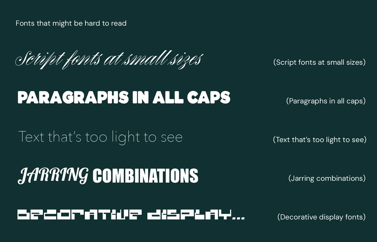
Use your noggin for: script fonts at small sizes, paragraphs in all caps, text that's too light to see, jarring combinations, decorative display fonts.
Good font choices, on the other hand, make everything feel smooth. They create a seamless journey from headline to CTA. They help your content breathe. They make people want to keep reading.
Readability affects:
Skim-ability: Can someone quickly get the gist without squinting?
Comprehension: Is your message clear at a glance?
Accessibility: Are your fonts legible on mobile, to screen readers, and for users with dyslexia or vision impairment?
Trust: Does your text feel clean and polished, or chaotic and confusing?
This is where strategy meets design. Typography isn’t just a pretty face, it’s core to how people experience your brand. And when that experience is easy, effortless, and enjoyable? People come back for more.
TL;DR: Fonts are emotional, strategic, and everywhere
Fonts are working behind the scenes from day one to build familiarity and trust.
That trust is everything. It’s what makes someone book you, refer you, or even read the next slide. Fonts create consistency. Consistency builds trust. Trust leads to sales. The end.
So while your logo might eventually end up on a billboard (go you), your fonts are already out there doing the hard work of making people believe in your brand now.
Let’s sum it up:
Fonts tell a story before you do.
Fonts are seen more than your logo.
Fonts make or break your brand's vibe.
Fonts are one of the easiest ways to stand out without overhauling your entire brand.
Want help picking your brand fonts?
I do this stuff all the time. For clients. For templates. For fun on a weekend (jokes, you got me, but I do love them dearly).
Download my free brand strategy guide to dig deeper into your brand energy before you choose your typeface soulmate.
Or if you’re wanting someone to help do the choosing with you, discover my branding packages to peruse my project options.

Meet your designer, Ruth
Like what you read?
Discover my services or get in touch to see how I can help you smash your goals and grow your business.