Using Font Psychology to Choose Your Brand Fonts
Why font psychology matters more than you think, especially when building a brand with personality.

Font psychology is all about how different typefaces evoke specific feelings and subconscious messaging. We’re talking trust, excitement, elegance, playfulness — all subtly communicated through the fonts you choose.
Research backs this up: fonts influence how we perceive messages, even before we’ve consciously processed the words themselves (Sheen et al., 2025).
And in the context of branding? It’s got nothing to do with trends and pretty-ness.
It’s giving strategic 👏 queen 👏 energy 👏.
If you know me, you’ll know I think fonts are more important than logos — especially for small businesses and startups.
When your name hasn’t entered the household vocab (yet!!!), your fonts are going to do most of the heavy lifting. They show up in your Instagram carousels, your homepage headlines, your email banners — all the places your logo might not be the right fit for.
So, yes, your logo matters. But your brand fonts?
Fonts are the real MVPs of your visual identity.
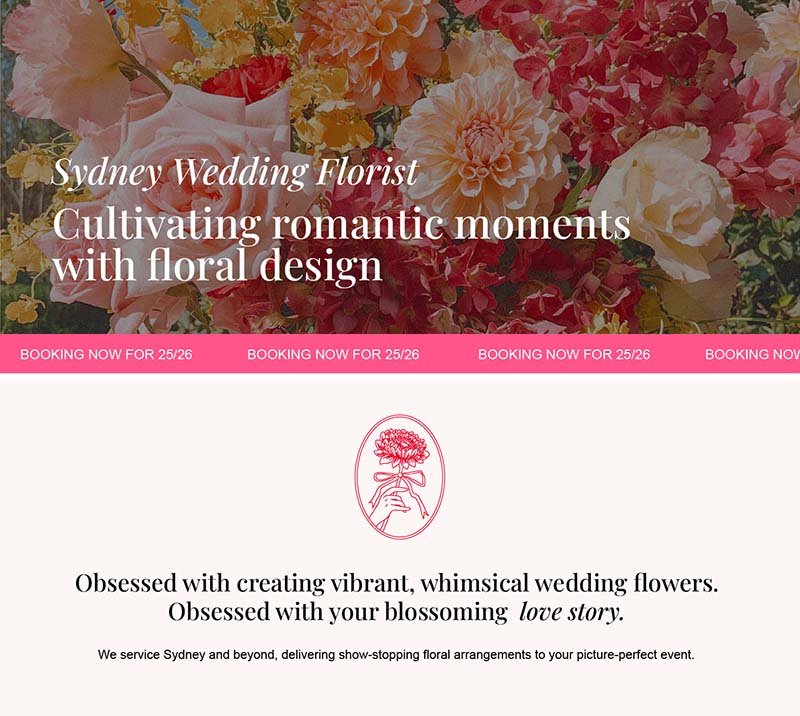
Let’s take a look at one of my favourite projects to date, Paper Daizy.
In the first example, I’ve used pretty standard Google fonts, Playfair Display and Arial. They’re fine… but we’re looking for the cherry-on-top that takes her brand from standard to SLAPS.

Much better, right?!
It’s magical, romantic, and most importantly, original. And with just a few tweaks and a little understanding, your brand fonts will be telling your story too.
A bold, geometric sans-serif font can feel modern and assertive. Meanwhile, a delicate script font whispers elegance and softness. In the research world, studies have shown that serif fonts, for example, can lend scientific writing more credibility, while sans-serifs feel more modern and readable (Kaspar K et al., 2015).
Choosing the right font combination for your brand means aligning these emotions with your tone of voice, values, and ideal audience.

If you’re not clear on any of those yet, I’ve got you — my free brand strategy guide is the best place to start figuring out who you are and how to show up in a saturated brand world.
Let’s get into the nitty gritty of font psychology, with examples FREE to use on Canva.
For headlines or body copy: serif, sans-serif, and monospace fonts
These categories are generally very versatile — you can use them across big statements and smaller supporting text. Just keep readability front of mind. Some are better suited to large formats; others will shine in paragraph form.
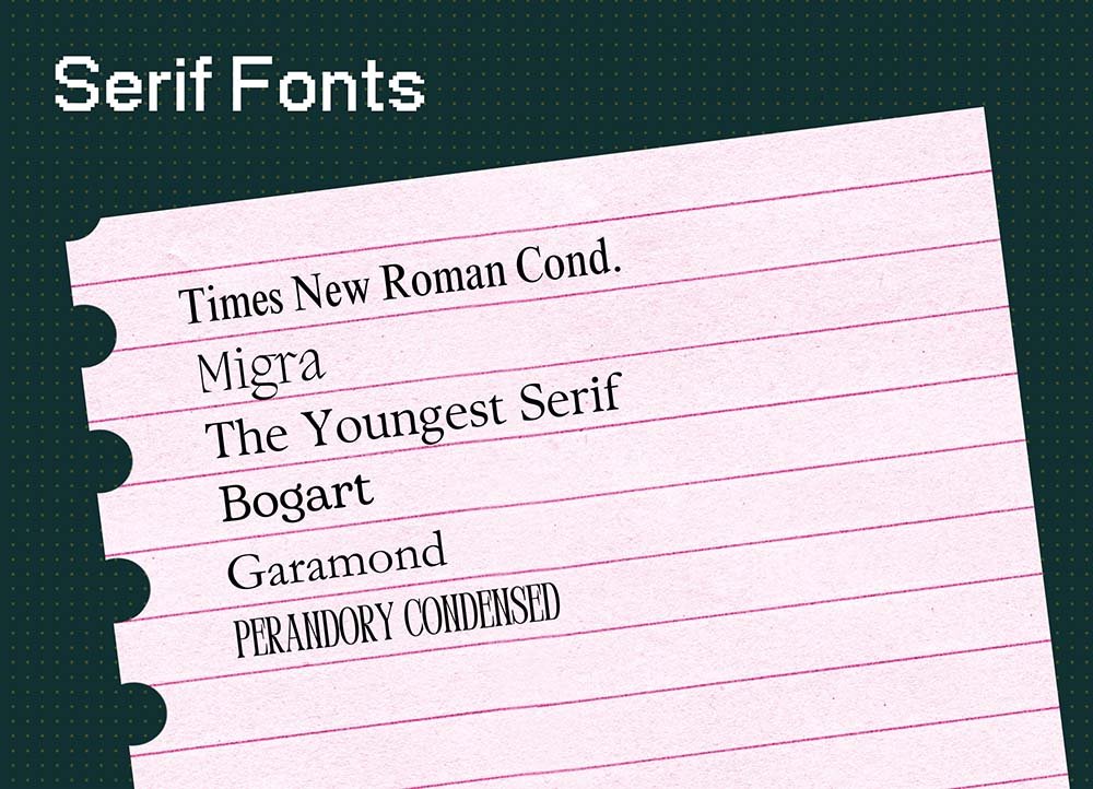
Serif Fonts
Examples: Times New Roman, The Youngest Serif, Garamond, Perandory Condensed, Bogart, Migra
Vibes: Timelessness, storyteller, trustworthy
Serifs are the fonts with the little “feet” or finishing strokes. They feel bookish and rooted in tradition. You’ll often find them in editorial design, heritage brands, or businesses that want to feel well-established and credible.
Use these if your brand is built around authority, depth, or storytelling. They work in both headers and paragraph text — especially for brands that lean into timelessness or prestige.
Where to use:
Editorial-style blogs or packaging for premium goods
Service-based brands with a high-trust ask (like law, finance, or consulting)

Sans-Serif Fonts
Examples: Akzidenz Grotesk, Agrandir, Franklin Gothic, Avenir, Univers, Futura
Vibes: Modern, clean, confident
Sans-serif fonts skip the flourishes and go straight to the point. They’re everywhere for a reason: they’re readable, neutral (in a good way), and super versatile. If you want your brand to feel sharp, current, and uncluttered, this is where to start.
Use sans-serifs when clarity is key, or when you want to feel like you’re running a startup that actually gets funded. They pair well with almost anything — a seriously good foundational choice.
Where to use:
Tech, startup, or SaaS branding
Strategic service providers that want a minimalist edge
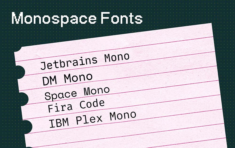
Monospace Fonts
Examples: Jetbrains Mono, DM Mono, Space Mono, Fira Code, IBM Plex Mono
Vibes: Minimal, structured, editorial-techy
Monospace fonts give every character the same width, creating a grid-like effect. Think old-school typewriters, developer dashboards, or that satisfyingly nerdy newsletter you can’t stop opening. They're quiet but strong — great for brands that want to feel considered, digital-native, and slightly unexpected.
They can feel a little cold when used too heavily, but in small doses? Design gold.
Where to use:
Design studio or coding agency brands
Captions, quotes, or call-outs
Editorial sites or indie publications
Brands that lean into minimalism with a twist
For headlines or call-outs only: script, hand, and display fonts
These styles are high impact — and like most things in life that pack a punch (I’m talking to you, espresso martinis), they’re best in moderation. Save these for short, emotional, or expressive moments where you really want to dial up the personality. More is not more!
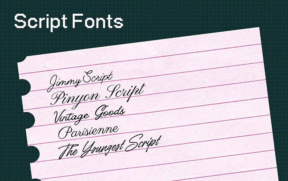
Script Fonts
Examples: Jimmy Script, Pinyon Script, Vintage Goods, Parisienne, The Youngest Script
Vibes: Elegant, romantic, creative
Script fonts mimic cursive handwriting with flowing lines and graceful movement. They’re your go-to for moments of softness, femininity, or emotional pull. Perfect for wedding vendors, beauty brands, or any business built on artistry.
They aren’t super readable at small sizes, so don’t use them in paragraph form, for long brand names, or headlines over 1 line.
Where to use:
Creative service professionals with a romantic vibe
Event invites, product packaging, or brand marks
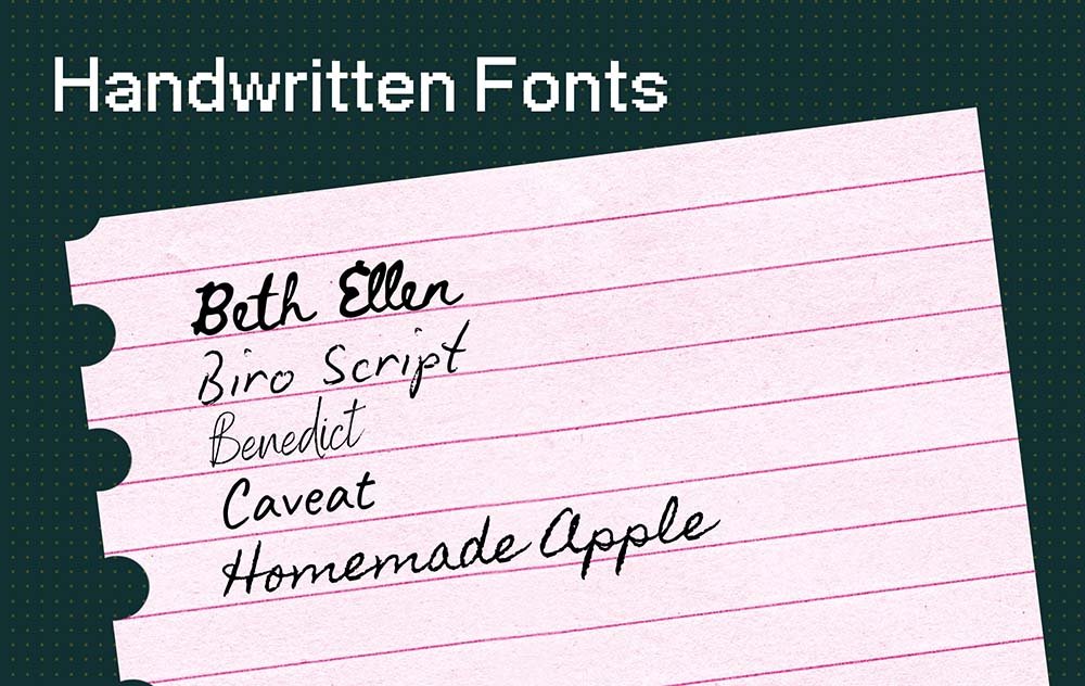
Handwritten Fonts
Examples: Beth Ellen, Biro Script, Benedict, Caveat, Homemade Apple
Vibes: Approachable, personal, warm
Handwritten fonts feel like a love note scribbled on a napkin — perfectly imperfect and human. These are ideal for founders-first brands that want to communicate directly and sincerely.
Unlike script fonts, they’re less swirly and more casual. They give off “real person behind the brand” energy, which is perfect for small-batch businesses, creatives, or personal brands.
Where to use:
Brand signatures or notes “from the founder”
Community-based, story-driven brands
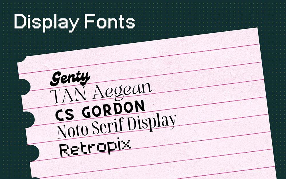
Display Fonts
Examples: Genty, TAN Aegean, CS Gordon Serif, Noto Serif Display, Retropix
Vibes: Bold, distinctive, expressive
Display fonts are designed for impact, not subtlety. These are the kind of typefaces you use for a headline and only a headline. Think high-fashion brands, creative agencies, and anyone who likes to take up visual space.
They’re not always practical, but that’s kind of the point. Use them to inject drama, flair, or a little bit of unexpected edge.
Where to use:
Homepage hero sections
Launch campaigns or product features
Edgy fashion, art, or editorial brands
Any moment where you want the reader to stop and stare
Font Pairing Tips (Free Canva Fonts)
Some curated Canva-friendly font combinations that balance strategic brand personality with readability:

Vintage Goods / CS Gordon Serif / Univers
Great for classic brands with a playful edge.

Agrandir / The Youngest Script / The Youngest
Modern and soft — perfect for creatives or lifestyle brands.

Perandory Condensed / Pinyon Script / Avenir
For elegant, professional brands that want depth and drama.

ITC Franklin Gothic / Beth Ellen / ITC New Baskerville
Balanced and grounded. For founders who lead with clarity and care.

Bogart / Akzidenz Grotesk
Structured with just enough personality — a go-to for consultants or creatives.
Pro-tip: using less fonts can look just as exciting! Just try and create hierarchy through style choices like bold, all caps, or size.

Noto Serif Display / Parisienne / Noto Serif
Calm, delicate, and deeply refined.

Migra / Migra Italic / Futura
For thoughtful disruptors. Editorial meets design-forward.

DM Sans / DM Mono
Clean, calm, and ultra-modern. Tech founders, this one’s for you.
TL;DR (I gotchu, busy business owner)
Here are the six font categories we discussed:
For headlines or body copy:
Serif Fonts: Classic, traditional, and trustworthy. Great for brands with heritage, depth, or story at the core.
Sans-Serif Fonts: Clean, modern, and versatile. Ideal for tech companies, product brands, or minimalist creatives.
Monospace Fonts: Minimal, structured, and a little retro. Great for editorial-tech brands or indie design lovers.
For headlines or call-outs only:
Script Fonts: Elegant, creative, and often romantic. Perfect for stylists, event professionals, or beauty brands.
Handwritten Fonts: Casual, friendly, and human. For small businesses, personal brands, or community builders.
Display Fonts: Bold, unique, and attention-grabbing. Ideal for fashion brands, creative agencies, or campaign launches.
Remember: Choose your brand fonts based on strategy and type psychology, not trends.
Fonts are micro-messengers of your brand strategy. The way your words look plays a huge part in how they come across and feel.
So instead of copying someone else’s aesthetic or defaulting to a Canva template, go deeper. Choose fonts that align with your energy, your story, and the customers you want to attract.
Because when you speak in a voice (and typeface) that’s true to you, your audience doesn’t just see your brand, they vibe with it.

Meet your designer, Ruth
Like what you read?
Discover my services or get in touch to see how I can help you smash your goals and grow your business.