How to create a colour palette with strategy
The steps (and knowledge) to create a meaningful colour palette for your brand and business.
Colour is a (not-so) secret language that speaks to our emotions, influences our decisions, and shapes our perceptions. If you're a small business owner, understanding the psychology of colour is your key to building a brand that truly connects with your audience.
When you think of Christmas, what springs to mind? I’m guessing that aside from a Christmas tree and time with family and friends, the images that you draw up will be gifts and decorations made with red and green. For McDonalds, the colours of bright red and yellow are likely part of the first thing you think about.
Your colour palette is the most important factor for brand awareness
Aside from a logo, colour palettes might be one of the first things that comes to your mind when you think about designing your small business branding. And rightly so, according to research, having a signature colour for your business marketing, used consistently can increase brand recognition by up to 80% [Touron Law].
We’re going to dive into how different colours, and also shades and hues, can evoke different emotions in your audience, and how you can leverage this knowledge to grow brand awareness, and build a stronger brand.

Exercise:
Think of at least 3 brands that you interact with regularly, like your local supermarket, Starbucks, or your favourite online store.
Visualise the colours that they use on their storefront or website - can you recall them with ease? Jot down if so.
The Psychology Behind Colour
Before we dive into the individual colours, let's explore why colour psychology matters for your small business. It's not just about selecting colours that look appealing but about choosing shades, hues, and an overall palette that resonates with your target audience and reflect your brand's values.
The goal is to give your audience an understanding in a split second about your personality, values, and VIBE.
So, before you jump in to picking a pretty colour palette, you need to define your values, and keep them handy at all times. Then, you need to take a deep look into your customers and audience, and what you want them to feel when they interact with your brand. And last, but not least, you need to research your industry and competitors to see what they are doing well, and what they could improve on.
There’s nothing wrong with making things pretty, but having meaning and connecting with your audiences emotions will help drive your brand to cult-status.
Step 1: Define your brand values
Step 2: Dive deep into audience research
Step 3: Research what’s happening in your industry
The meanings of colour
Like many things to do with design, colour can be subjective. I think the only thing we can agree upon as graphic designers is that comic sans should NOT be used to make a logo at whatever cost.
There are, however, some general rules of colour meanings that are universally agreed upon. You can use this knowledge to guide your initial decisions about what colours could be included that truly reflect your business and its values.
Remember, this is just a starting point, and controlling the overall effect the colour palette has on your audience is the end goal. So don’t take the meanings too literally! When we combine colours together strategically, that’s what can create powerful branding right off the bat, and build your brand awareness for years to come.
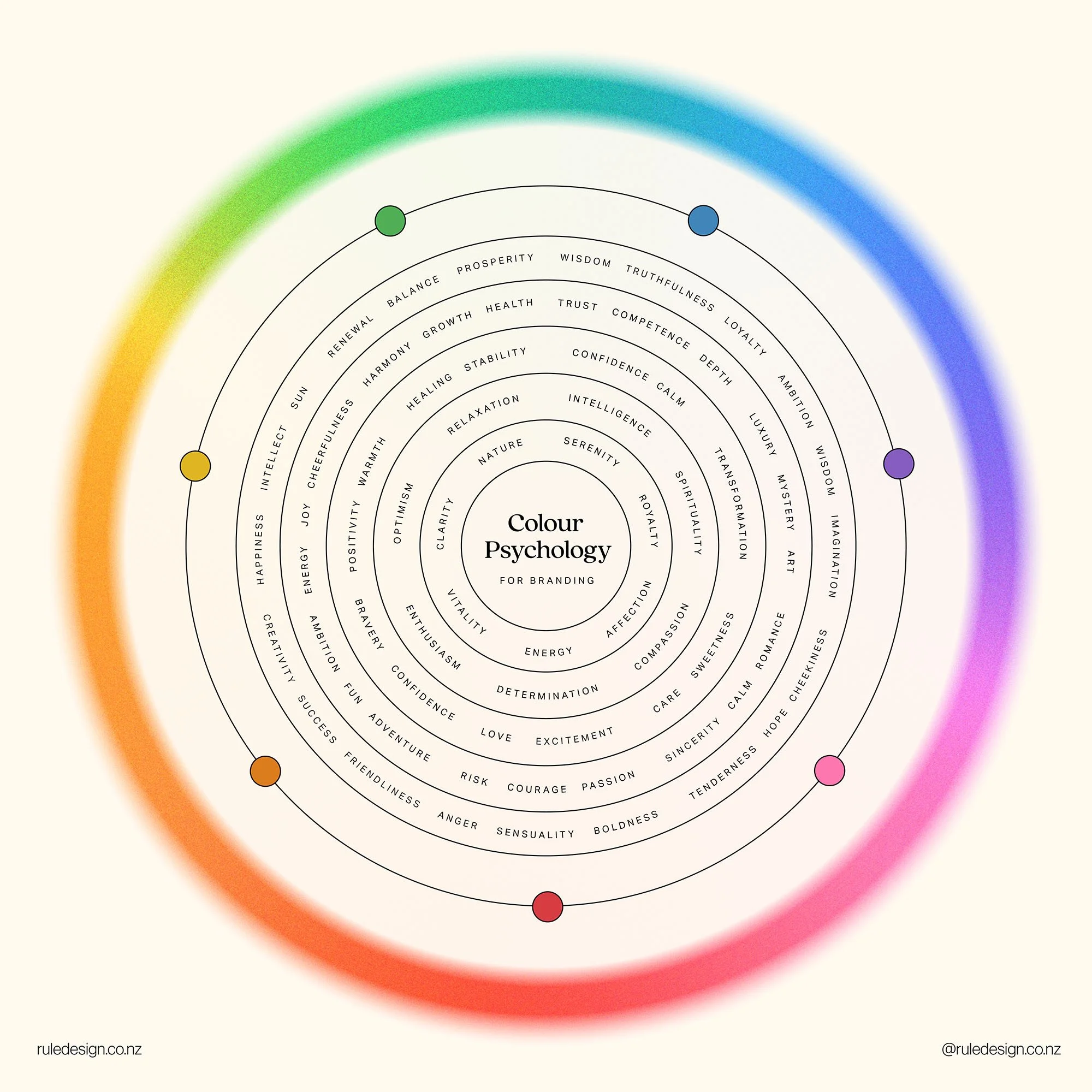
Colour psychology chart for the meanings of colours
Think back to the example of McDonalds, combining the urgency of bright red and the optimism and joyfulness of yellow, makes a strong argument for customers to go and enjoy their Happy Meal, right now.
It might be obvious, but you also have to LOVE your colours, as you should be using them day in, day out, consistently across all of your touch-points, from social media, to flyers, to your website.
Step 4: Match your brand values to specific colours to start making your palette. Play around with different combinations to find the shoe that fits.
Tints, Shades, Tones, and Hues - What’s the difference?
The tints, shades, tones, and hues of the colours can also significantly change the meaning. Colours themselves are the building blocks, each carrying their own unique emotional and psychological associations, but the subtleties of these building blocks of the colour matter just as much.
The definitions:
Hue: The spectrum of pure, unadulterated versions of colours.
Shade: Hue + Black
Tone: Hue + Grey
Tint: Hue + White
Each of these aspects plays a crucial role in how your brand is perceived, impacting everything from the initial impression to long-term recognition. So, understanding the language of colours, along with their variations, is paramount in creating a brand that tells your story and connects with your audience.
Let’s take a look at the colour purple for an example. Purple is well-known to create a sense of luxury, creativity, and sophistication.

Hue (Pure Violet): This is a a striking shade of violet, and often symbolises creativity and luxury.
Shade: This dark plum shade deepens the essence, representing mystery, power, and a touch of drama.
Tone: On the other hand, this colour softens the original hue, conveying balance, and a sense of calm.
Tint: the colour lightens into a gentle pastel, suggesting imagination and innocence.
Tweaking the shades, tones, and hues of colours can be the key to unlock a true vibe of your brand. Always trust your gut, and if you’re not sure, try and ask someone who is in your target market for a second opinion.
Step 5: Tweak the shades, tones, and tints of the colours in your palette to make the meanings more nuanced.
The contrast of your palette
When crafting your brand's emotional palette, consider not only the colours themselves but also their contrast. Adequate contrast ensures readability and accessibility, especially in web design.
A harmonious palette can evoke the desired emotions, but the right balance of light and dark shades ensures legibility.
To check the contrast of your palette, you can use free online tools like Colour Contrast Checker . Make sure that at least a handful of the colour combinations can be used together. If not, consider lightening or darkening shades to create a more versatile palette.
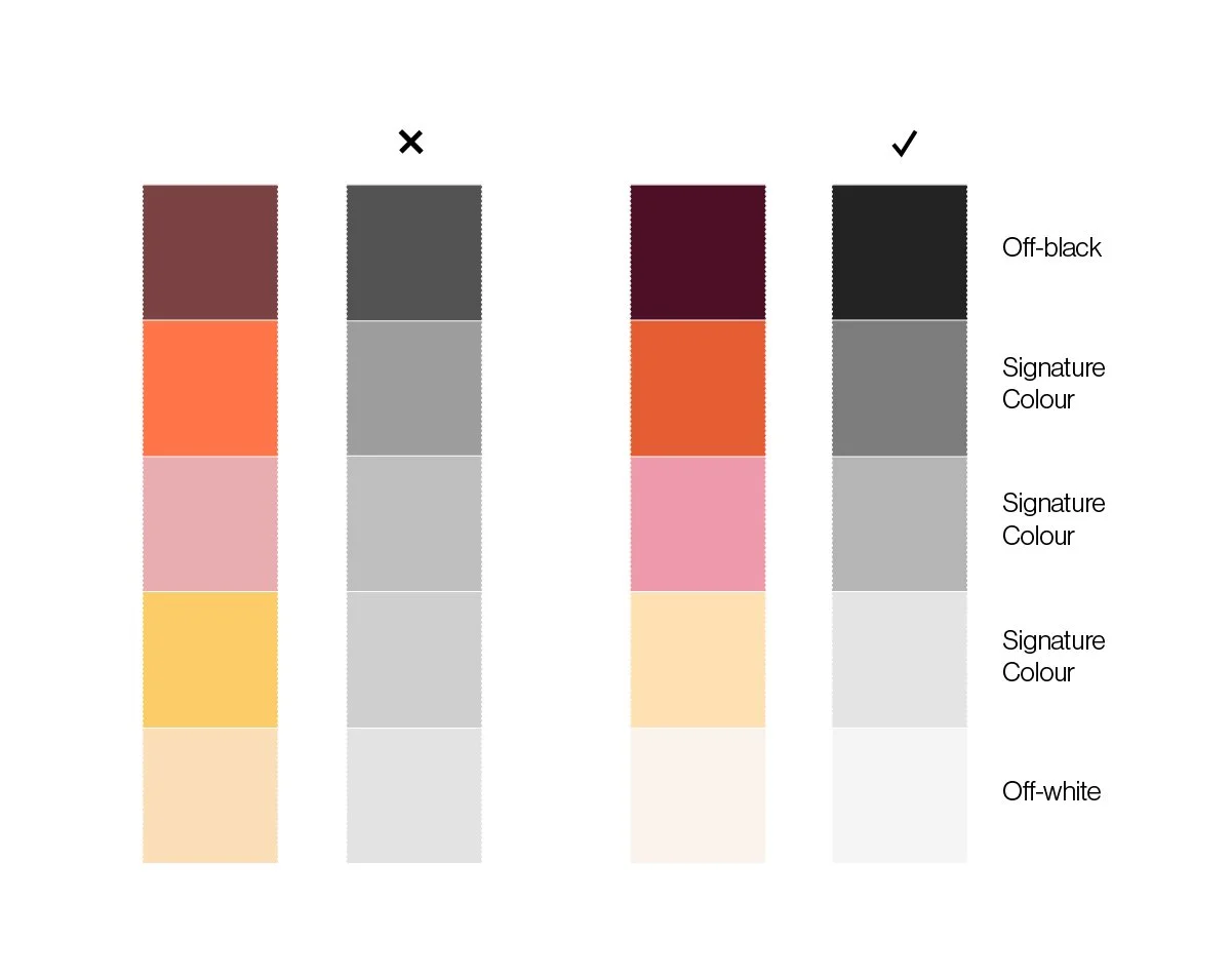
Changing the palette to grayscale is a simple, yet effective way to check the contrast
The application of your palette
Envision how your palette translates across various marketing channels—whether it's on social media, your website, or printed materials. You can use the Palette Visualiser from Coolors to see your palette on a range of mockups. If you’re working with a brand designer, they should include some examples of your palette in action to ensure that it’s seamless and useable.
The versatility of your palette enhances brand recognition and leaves a lasting impact on your audience. Keep your design coherent yet adaptable to shine across all platforms.
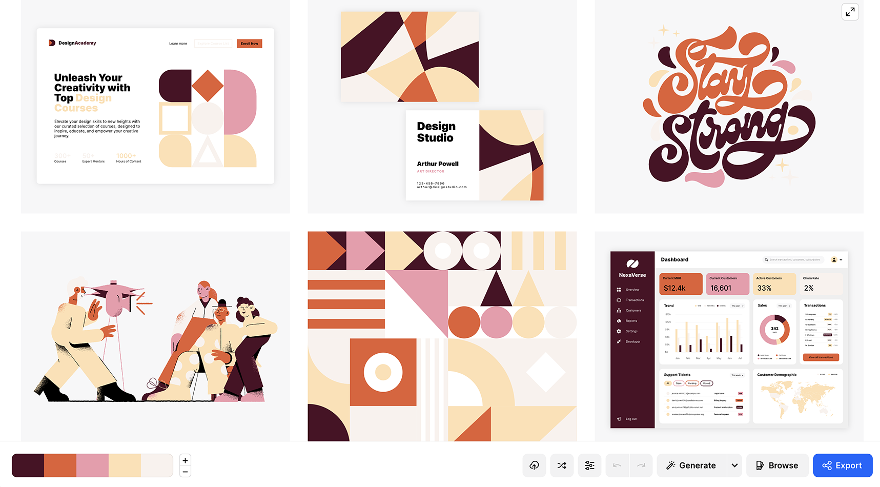
The Palette Visualizer is a free tool by Coolors
Step 6: Check the contrast and usability of your palette using free tools.
Applying Colour Psychology to Your Brand
Understanding how colours influence emotions and perceptions is just the first step. To apply colour psychology effectively to your small business branding, consider these tips:
Define your brand values: Knowing who you are and what you stand for is the first step in creating a strategic colour palette.
Dive deep into audience research: Understand your target audience's preferences, and what you want them to feel when they interact with your brand.
Research what’s happening in your industry: Be aware of colour trends and industry standards. While you want to stand out, going too far from industry norms can be confusing for your audience
Match your brand values to specific colours: Experiment with different combinations to find the shoe that fits.
Tweak the tints, shades, and tones: To make the meanings more nuanced and your palette more original, play with the details.
Check the contrast and usability: Use online tools and mockups to see how versatile and useable your palette is.
Going forward with your brand’s colour palette.
Consistency is key: Maintain consistency in your colour choices across all branding materials, from your logo to your website and marketing materials. Remember that your colour palette is the biggest factor for brand awareness.
Embrace flexibility: Your brand can evolve over time, so don't feel locked into your initial colour choices. However, for any changes you do make, make a plan to transition gradually, or announce big changes to your audience to avoid confusion.
Colour psychology is a powerful tool that small businesses can leverage to create a compelling brand identity.
Each colour communicates specific emotions and values, and the right colour palette can help you connect with your audience on a deeper level.
By choosing your colours thoughtfully and remaining consistent, you'll be well on your way to crafting a brand that resonates with your customers and sets you apart in the competitive small business landscape.

Meet Ruth - your freelance designer.
Good things come to those wait who have bold and beautiful branding and websites.
Discover my services or get in touch to see how I can help you smash your goals and grow your business.