5 ways to make your DIY website look professional
Do you have a DIY website that looks… DIY? It’s not doing your brand any favours, and it’s turning off potential customers as quick as it takes to turn off a light switch.
I’m not even exaggerating. According to research, it takes just 50 milliseconds (or 0.05 seconds) for users to form their first impression of your website. So you had better make that time count!
As a web designer, I probably take a bit more time than most to think about exactly what I don’t like about an unprofessional or clunky site when I’ve landed on it. And best you believe I take notes!
I’ve rounded up 5 simple ways that will take your website from amateur to professional in no time. Whether you're a seasoned entrepreneur or just starting out, these simple tweaks will elevate your online presence and leave a lasting, and importantly, good impression on your visitors.
The problem: Your DIY website looks DIY.
Why it’s holding you back: Potential customers get the impression that you aren’t trustworthy or professional, so won’t buy or enquire from you.
The solution: Follow the easy and not-that-time-consuming steps below to make your website look instantly more professional.
Update Your Favicon
Let's start with the basics—your favicon. This small but mighty icon is like a little business card for your website. It appears in the browser tab, bookmarks, and even when users save your site to their home screen.
Sure, it might only be a small piece of the puzzle in building up your brand recognition, it’s more that NOT having it looks super unprofessional. And it will take you like 5 minutes to fix, so you have nothing to lose.
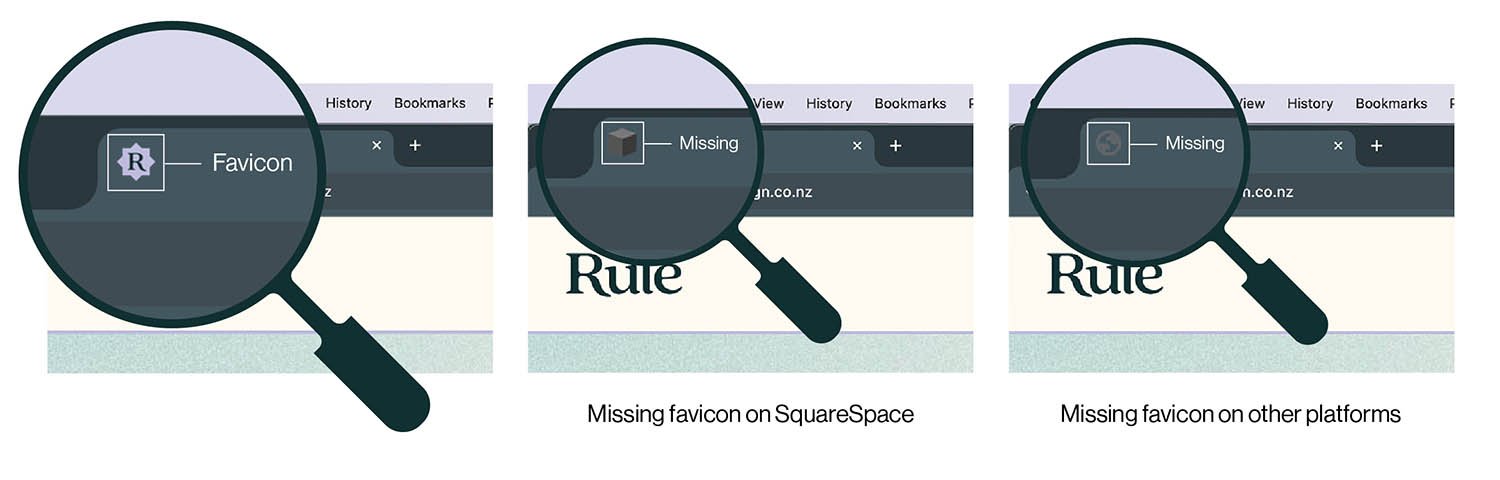
Wondering where the favicon is? This is what it looks like on an open browser tab
Make your favicon
Create a favicon that's visually appealing and uses your unique branding to stand out. You can use software like canva.com. It will be scaled down to 16x16px (i.e. TINY), so don’t use a full logo. Use your brand logomark, or a symbol or icon that represents your brand. Make sure it's clear, crisp, and reflective of your brand identity.
What size and format should the favicon be?
PNG and SVG are two of the most commonly used file types. Either way, make sure it has a transparent background! Follow the instructions from your website provider for their recommended sizes.
Shopify is 32x32px
Squarespace is 100x100px
Rocketspark is 500x500px
Upload to your website
Upload instructions will vary between website providers, so simply search ‘how to upload favicon to [website provider] website’ and a help article should pop up. Or head to the links below.
Upload instructions for Rocketspark
Step 1:
Create a favicon that represents your brand (1:1 ratio, PNG or SVG format), and upload to your website.
Design Your Footer
Footers are an often overlooked but essential part of your website's design, and is a great piece of real estate to use to your advantage. They can tie up all of the loose ends for the user, like the final chapter of a good book.
Done well, a footer can provide an alternative way to navigate around your site, and an opportunity to get more keywords and links on every page for your SEO.
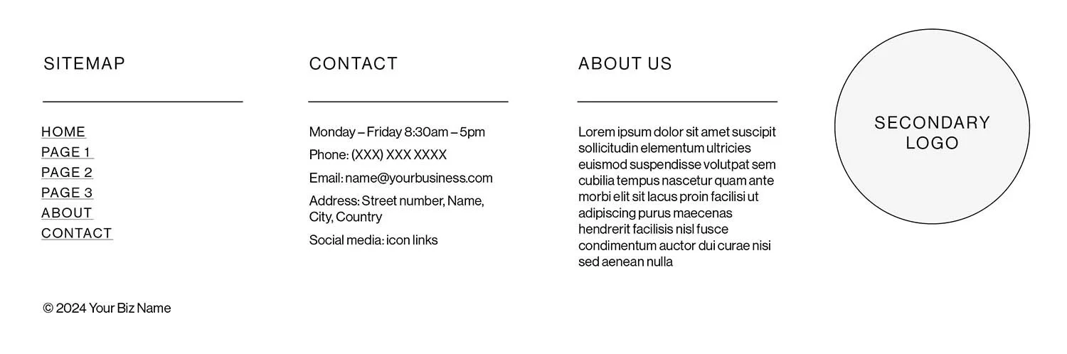
Try out this footer template and fill in the gaps
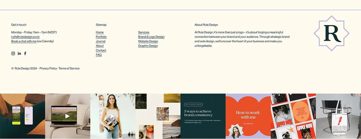
Here’s what it looks like on my website
What to include in your footer
Your logo or an alternative mark
A brief business description including some juicy keywords
A sitemap listing all the main pages on your website
Links to your social media profiles
Contact information
Copyright information
Last, but not least, your legal pages and disclaimers.
You can get some great inspiration at footer.design, but don’t stress if it’s not as flash as these ones, just including the above info, and upgrading from the bare minimum will be a huge improvement.
Step 2:
Add additional information to your footer with an organised layout. Think of it like a summary of your brand and business, and a gateway for your website users to keep interacting with you.
Check Your Legal Requirements
Law = snore! I know (sorry, lawyer friends). Speaking of which, it’s time for a disclaimer of my own. The information provided in this article does not, and is not intended to, constitute legal advice; instead, all information, content, and materials available on this site are for general informational purposes only.
Phew, okay, that’s done! While it may not be the most exciting topic, making sure that your website meets all legal requirements is essential for building trust and credibility with your audience, and protecting your small business from any scary legal proceedings
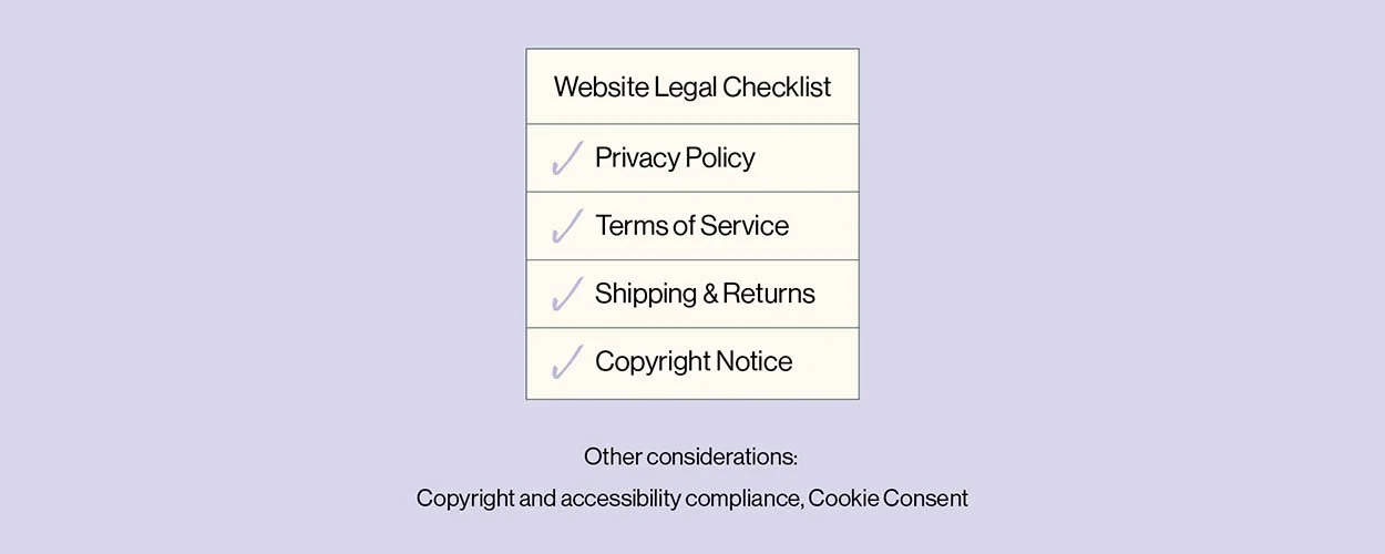
Privacy policy:
For the data that you need to collect by running a website, like how many people view pages and what cookies you collect. For NZ businesses, privacy.org.nz has a great online generator for your privacy policy.
Terms of Service:
All of the nitty gritty about how users can use your website. Legal Vision has a free online generator that you can use as a New Zealand or Australian business.
Shipping & Returns Policy:
For product-based businesses, you need to make sure that you’re following your country’s consumer laws. Very important. Don’t skip it.
And if your website is with Shopify or Rocketspark - it’s your lucky day. They have editable templates built in for you to use.
Copyright Notice:
Including a copyright notice on your footer is also a great idea. You don’t need to have a registered copyright to include it, you are simply stating that you are aware of the rights to protect your original work (your website).
If sh** hits the fan and you do have to call someone out, having a copyright notice in your footer will confirm that the copycat intentionally stole your work.
Two standard formats for copyright notices:
© [Current year] [Your Biz Name]
Copyright © [website creation date – current year] [Your Biz Name]
Check your country’s requirements
To make things more complicated, there are different requirements depending on where your business is based. For example, if you are a US-based business, you must follow accessibility compliance guidelines, and have a cookie opt-in. If in doubt about any of your legal requirements, make sure to get in touch with an actual, official lawyer. Phone a friend time!
Step 3:
Create or edit the required legal documentation on your website, making sure to have at least your privacy policy, terms of service, shipping & returns policy, and copyright notice easily accessible.
Use an Off-white Background Colour:
Getting back to the fun stuff - aesthetics and design. One quick way to give your website a polished look is to change the background colour to an elegant or warm off-white.
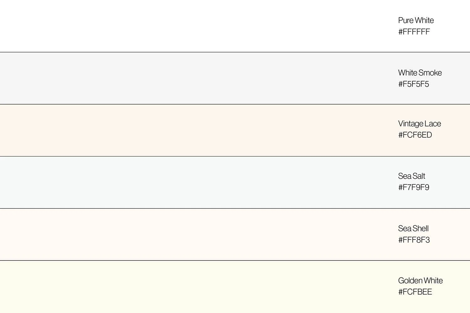
Feel free to try out these hex codes on your website!
Unique aesthetic and personality
While it may seem like a small detail, the background colour sets the tone (literally!) for your entire website and can significantly impact the overall user experience. They can create a more subdued and elegant aesthetic compared to stark white backgrounds, which may appear too bright or sterile for many brands and businesses.
Better user experience
An off-white background is easier on the eyes than a pure white background, especially when users are viewing the website for longer periods like while reading blog posts or long-form text. It’s also really helpful to users with visual impairments or sensitivity to bright lights.
A more comfortable browsing experience + reducing eye strain and fatigue = people will stay on your website for longer!
It also makes it look like you haven’t just swapped out the images on a template that you grabbed from your website builder. An easy win in my books.
Step 4:
Edit your design settings to an off-white colour for your site-wide background. Make sure that it’s super subtle and soft, no need to distract your users.
Update Your Fonts
Last but definitely not least, let's talk about fonts. I’ve said it before, and I will absolutely say it again… Fonts play a vital role in shaping your brand's personality and vibe. Think about it - your customer will spend more time with your fonts than your logo while browsing your site. So don’t overlook them!
Skip the generic system fonts please, meaning the ones that you’re website has automatically loaded in for you. Take the time to carefully select fonts that align with your brand identity and enhance readability, to complement your logo and reflect your brand's unique style.
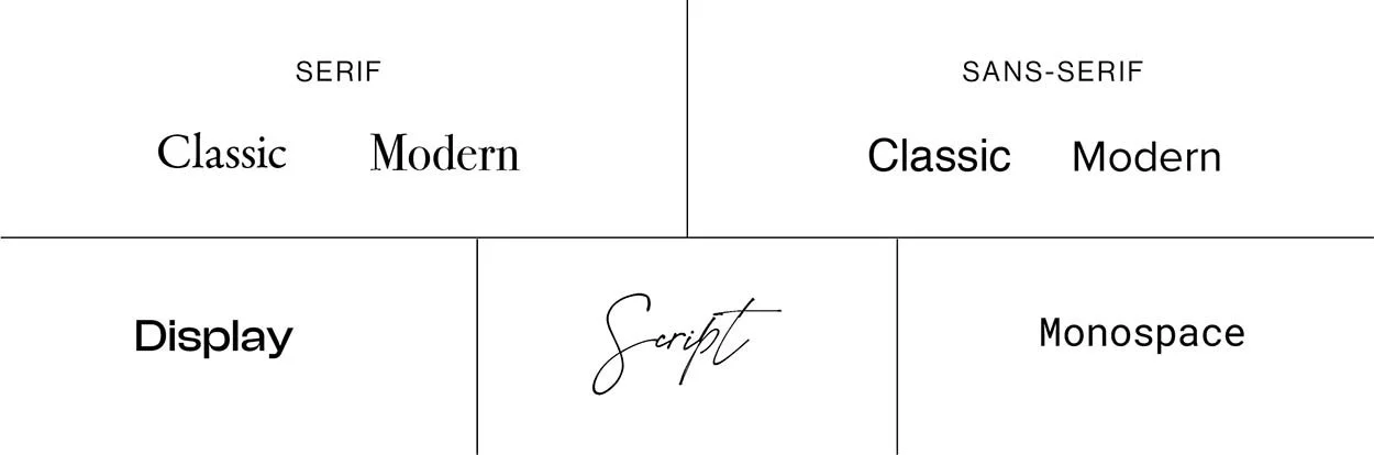
Choose a font that reflects your personality
For bold and daring businesses, display fonts are ideal as they are attention-grabbing and expressive. Make sure to only use these for the headlines, and pair with a modern font for body copy.
For elegant and luxurious companies, modern serif fonts, with their classic and decorative strokes, are refined and timeless.
For serious and authoritative brands, classic serif or sans serif fonts can work well to convey a serious and professional tone.
For authentic and personal brands, script fonts evoke a sense of personal connection, and modern sans-serif fonts with their clean and straightforward design, can also communicate transparency and simplicity.
Don’t use more than 2 fonts
A font for headings and a font for body copy is all you should need. Any more than that, it starts to look messy, and reduces your website speed (bad for SEO - need I say more). If you can get away with using only one typeface family in two different font weights, even better!
Keep it consistent
Consistency is key—use the same fonts across your website to create a cohesive and professional look. Bonus points if these fonts are the same ones you use across social media and other marketing channels.
Step 5:
Update your system fonts to ones that reflect your brand personality and vibe. Stick to maximum two fonts or font weights.
Let’s look at how far you’ve come, with these tips to level-up your DIY website.
Where we started: DIY website that looks DIY
No favicon
Bare minimum or no footer
Missing legal requirements
Basic white background
System fonts
Where we are now: Professional website without the price tag
A considered favicon that builds your brand recognition
A well-designed footer with all the details that your users will need
All of the legal pages and compliance to protect you and your customers
Site-wide background colour that sets you apart from off-the-shelf templates
Unique fonts that show your brands personality to your users
Struggling to get this done yourself, but don’t have the budget for a full website redesign?
I offer Design Day intensives where I can refresh the look of your website, ticking off all of these steps and more. Available for Rocketspark, Shopify, and SquareSpace websites.

Meet Ruth - your freelance designer.
Good things come to those wait who have bold and beautiful branding and websites.
Discover my services or get in touch to see how I can help you smash your goals and grow your business.