7 Web Design Stats That Will Make You Rethink DIY Sites
You threw together your website in a weekend with a drag-and-drop template, slapped on a Canva logo, and hoped that people would just... find it.
Honestly, I love the hustle! But if your site is the webby equivalent of a last-minute uni assignment, it might not be making the impression you think it is.
It may even be doing your business a disservice.
Let’s check out 7 hard-hitting stats from academic and industry sources that prove why your website needs to be more than “cute and kinda functional.” It needs serious strategy—we’re gonna be talking charisma and conversions, baby!
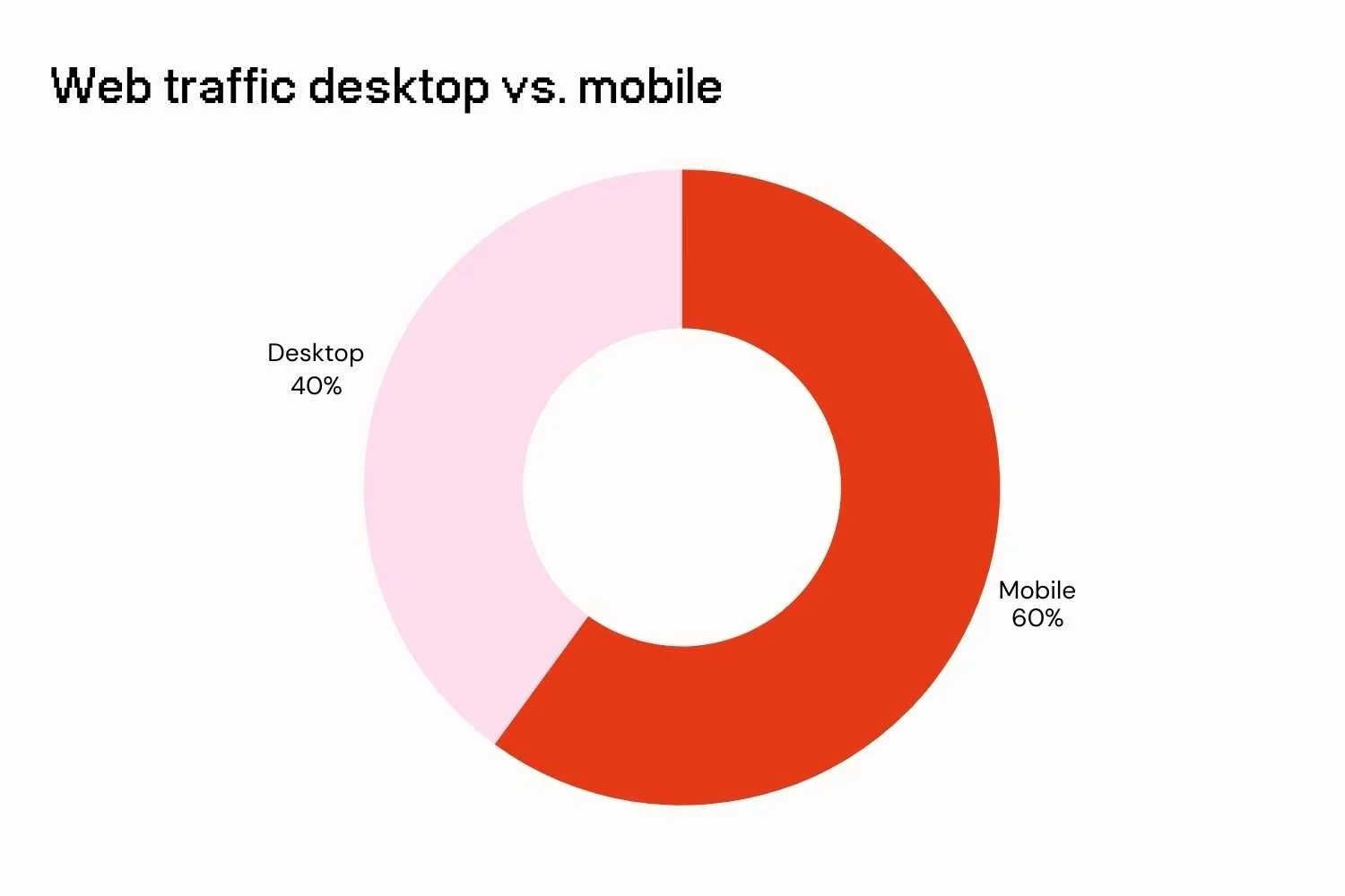
Over 60% of web traffic is from mobile devices
StatCounter Global Stats (2024)
More than half your traffic is coming from mobile devices, with tablets pushing this number even higher. If your mobile experience is wonky or broken, you’re not just losing that visitor if they bounce. You’re losing the referral network e.g. people they would have told about you too.
A GSMA report forecasts that mobile’s dominance will only increase, and predicts it will make up almost two-thirds of all internet use by the end of 2025 (GSMA, 2025). That’s not just a trend.
WHY IT MATTERS:
Seamless mobile access is pretty much expected, and anything less is a real risk to securing leads. If you have a design that’s clunky, and especially if it’s not mobile-friendly, visitors to your site are likely to leave quickly.
Google will also reflect this in their rankings. Your site will be penalised, and according to Forbes, you could lose between 5-30% of leads from this alone - eek!
TRY THIS:
Crack out your mobile phone and give your site a quick glitch check. Click on as many pages as possible (including your blog or product pages), and any other key links such as phone numbers, emails.
Are you frustrated at any point? If so, your visitors are guaranteed to be too.
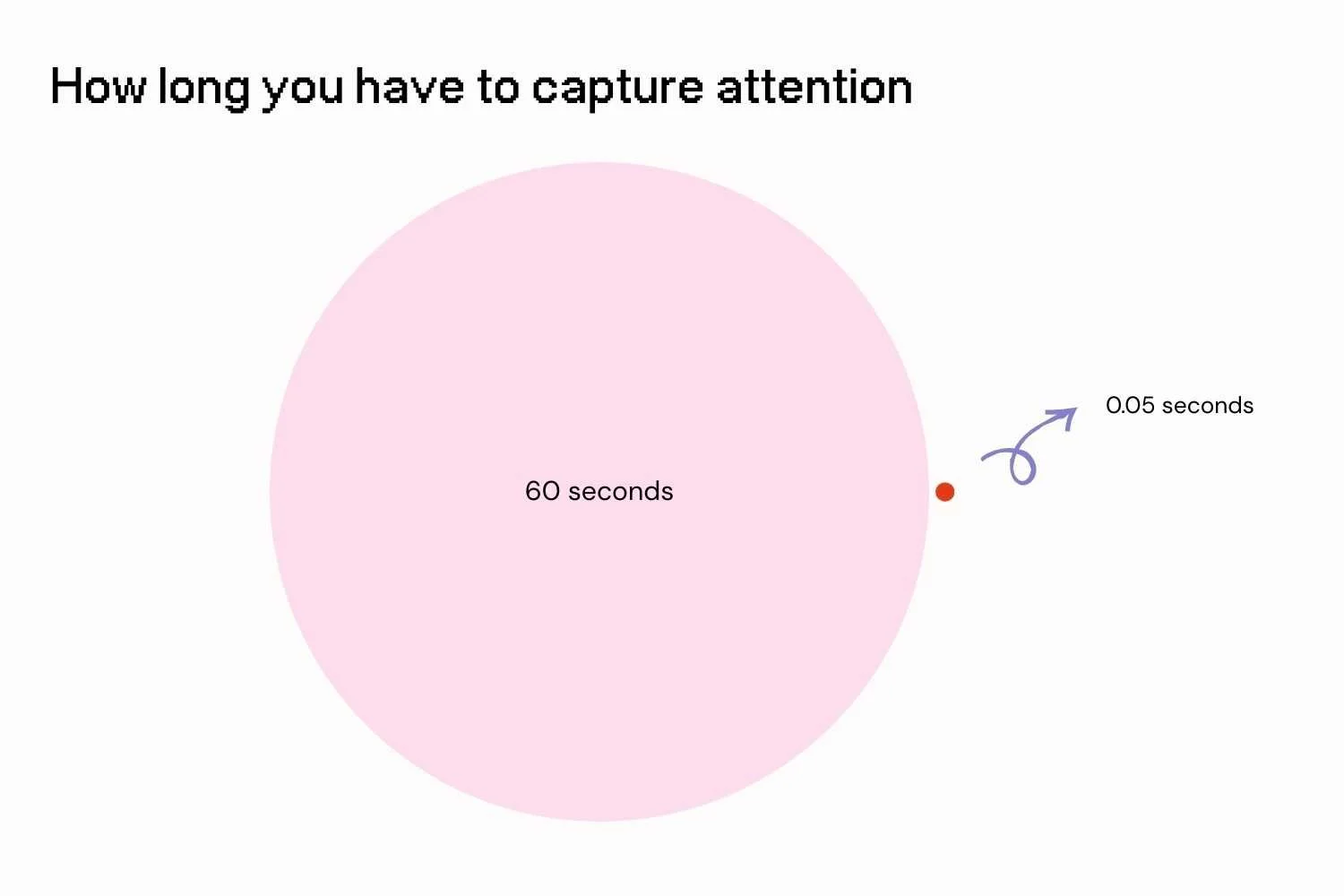
0.05 seconds is all you have to hook (or lose) someone
Lindgaard et al. (2006)
Yes, milliseconds—blink and they’re gone. First impressions happen before your visitors read a single word. If your homepage is chaotic, cluttered or confusing, your visitors are going to bounce. No matter how good the rest of your offerings are, the visitor probably won’t be sticking around to explore it.
WHY THIS MATTERS:
Visual clarity is essential to build not just conscious interest, but subconscious trust. Stanford found that up to three-quarters of users judge the credibility of your entire business based on site design within just 2.6 seconds. A good, clear structure can help visitors to navigate the site with ease, and in turn, what they can expect. Instant understanding translates to instant confidence in your site.
TRY THIS:
Wrangle a few people you know to run a 5-second test. Show them your homepage and get them to summarise what you do and who you do it for.
If they don’t get the vibe spot on, it may be time to rethink your hero section.
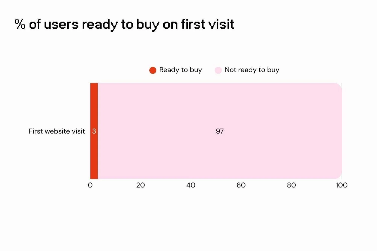
Only 3-4% of visitors are ready to buy on their first visit
Shopify (2023)
Yep - almost everyone on your site is just browsing. That doesn’t mean your website’s failing. That’s normal. However, one thing your site does need to do is keep people engaged and build relationships. It’s time to go past just pitching your offerings!
Educate them. Entice them. Give them a reason to come back (and then buy). This is where things like lead magnets, email opt-ins, freebies and retargeting magic come in.
People want to get to know you before they consider buying. You need to not just get visitors into the funnel, but keep ‘em moving on through.
Why this matters:
Building trust and emotional connection is critical to make your visitors want to stick around, helping to increase return visits and eventual conversions. This also creates the space to nurture and tell your unique, meaningful brand story.
Try this:
Front and centre, offer an engaging freebie on your homepage to help capture interest and convert window-shoppers into subscribers. Offer value first, then sale second.
57% of first-visit time is spent above the fold
Your site needs to be giving people a clear idea within the first screen scroll. That top-of-page space (aka "above the fold") is prime real estate. Use it to hook people, not confuse them, or you’ll be risking them swiping away.
The data shows that this simple improvement to your ol’ homepage (think a compelling headline and subhead) can more than double your conversions.
Why this matters:
Confused visitors don’t convert, they leave. Clarity in the fold prevents this. Your hero section should be a bit like your best elevator pitch and can help to set expectations early. Not only will customers be able to understand your offer quickly, but so will search engines - win-win!
Try this:
Spruce up your hero section with a concise headline supported by a subheading and call-to-action that lets visitors know what you’re all about.
88% of consumers say trust is a key factor in purchase decisions
People trust other people more than they trust brands. That’s why trust badges, reviews, star ratings, testimonials, “As seen in…” logos, and even a solid privacy policy aren’t just fillers or decoration. They cut anxiety and help to build credibility.
These small but powerful additions can help reduce the likelihood of cart abandonment, with Baymard (2024) finding that nearly a fifth of users abandon purchases due to a lack of trust in the site itself.
The same study also found that by simply adding a recognisable trust badge, sites experienced an up to 60% increase in checkout conversions.
WHY THIS MATTERS:
Anxiety around data security or just being ‘scammed’ in general is a real barrier to making visitors feel confident enough to buy. With a little sprinkling of reassurance in the form of trust signals, you can take this hurdle from unsurmountable to a tiny blip in the process.
TRY THIS:
Increase conversions further by embedding some testimonials strategically throughout a variety of locations on your site, not just on one dedicated page.
Get a few strong testimonials and put your best one above the fold on your homepage (i.e. the bottom of the screen). Pepper the rest throughout your site to help bolster your reputability.
77% of online shoppers read reviews before buying
BrightLocal Local Consumer Review Survey (2024)
Let’s narrow in on reviews specifically. If your site is missing them, you're lacking the one thing your future customers actually want: proof. Social proof is your best salesperson. It shows that real humans have bought from you, loved it, and are willing to say so publicly. This is especially powerful if you’re a service provider to give an idea of what it’s actually like to work with you.
Bazaarvoice’s Shopper Experience Index found that product pages with a minimum of one review can garner an almost 3.5x increase in conversion rate and a 4.5x increase in revenue per person in comparison to pages with no reviews. That’s a worthy reason to add that review section.
(Don’t have reviews yet? Ask. People are way more willing to write them than you think.)
Why this matters:
Brand claims are great, but customer voices are even better. Their authenticity is persuasive. You may not have the opportunity to contact all potential leads, so you need to make sure your site is doing the hard yards for you and building trust. If it isn’t, leads may go in search of proof from competitors and say goodbye to your site for good.
Try this:
Have a happy client or buyer? Ask them if they can provide a testimonial, or even a little 1-liner tidbit. You can use these to add evidence of how amazing your services or products are throughout your site’s key touchpoints - think the service and contact pages in particular.
88% of users won’t come back after a crummy experience
Deloitte Ireland “Milliseconds Make Millions” (2020)
Just like a bad first date, a bad user experience makes people leave and never come back. I’m talking things like slow load time, confusing navigation, broken links, unclear copy. They bounce, they forget you, and they find someone else who looks like they know what they’re doing.
Your website needs to not just impress, but function seamlessly. Otherwise, today’s bounce may become your competitor’s future customer and not yours.
Why it matters:
Loss of repeat traffic is guaranteed to kill brand recall, and it’s not just bounce rates that are harmed either - for every additional second of delay, your conversion rate can drop by up to 10% (Deloitte Ireland, 2020). Ouch! Google isn’t likely to take very kindly to your slow site either. Its algorithm factors speed in when ranking sites, so if you’ve got a slow one, you’re guaranteed to drop down the list.
Try this:
Do a sweep of your site for the main culprits of slow loading - think compressed images, unused plugins. Compare the speed before and after using a tool such as PageSpeed Insights.
Bonus Round: Fix It Now Checklist
If your site is looking a bit sad, it’s time for a speedy credibility boost. Let’s cover a few quick and easy changes you can make to solve the most common mistakes seen on DIY websites.
Clarify your hero message
Rewrite for clarity, not cleverness! Think benefits, who you serve, and how.Fix your Mobile UX
Prioritise it with thumb-friendly navigation, readable text, and content scaling.Speed it up
Compress your images, clean your plugin drawer and ditch bloated themes.Showcase credibility
Add testimonials and reviews to high-traffic pages and CTAs.Think long-term
When you’re ready, hire a pro in strategic design (*cough cough*) to help you level up.
TL;DR (I know you’re a busy business baddie!)
DIY websites are a fab starting point, but they’re definitely not the finish line for your biz. At the end of the day, your website isn’t just a digital placeholder - it’s your 24/7 salesperson, trust-builder, and brand ambassador all in one.
With a few tweaks to make sure you’re on the right side of these statistics, you’ll be ready to go from “meh” to “magnetic”.
Ready for a pro-level glow-up?
Let’s build a website that feels as good as it looks—one that’s SEO-slaying, mobile-friendly, and built to actually grow your business. Check out my website packages or book a chat if you’re ready to step it up.
Meet your designer, Ruth
Like what you read?
Discover my services or get in touch to see how I can help you smash your goals and grow your business.


